![Sound: an interactive lesson via Bartosz Ciechanowski [Shared]](https://welchwrite.com/blog/wp-content/uploads/2022/01/on-the-line.jpg)
Sound: an interactive lesson via Bartosz Ciechanowski [Shared]
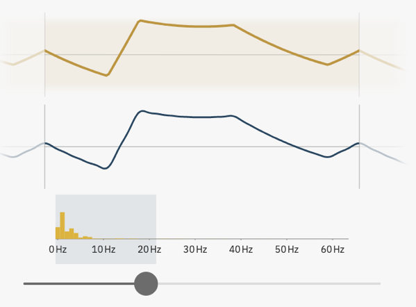
Invisible and relentless, sound is seemingly just there, traveling through our surroundings to carry beautiful music or annoying noises. In this article I’ll explain what sound is, how it’s created and propagated.
Read and interact with the lesson – Sound: an interactive lesson via Bartosz Ciechanowski
Related Items:
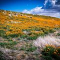 California Poppy (Eschscholzia) 2003, California Poppy Reserve, Lancaster, California [Photography]
 Noted: Give It a Rest, Pumpkin Spice Lattes: It’s Hot Toddy Season Too! via The Kitchn
New Design: Vintage Oberkampf & Cie. Cotton Textile (1785) from the Cooper Hewitt Museum Collection Tops, Pillows, and More from Douglas E. Welch Design and Photography [For Sale]
Noted: Give It a Rest, Pumpkin Spice Lattes: It’s Hot Toddy Season Too! via The Kitchn
New Design: Vintage Oberkampf & Cie. Cotton Textile (1785) from the Cooper Hewitt Museum Collection Tops, Pillows, and More from Douglas E. Welch Design and Photography [For Sale]
 Learn How to Draw Flowers, Trees, and Other Plants With These Books via My Modern Met [Shared]
New Design: Redbud Pattern Illustration from Douglas E. Welch Design and Photography [For Sale]
Learn How to Draw Flowers, Trees, and Other Plants With These Books via My Modern Met [Shared]
New Design: Redbud Pattern Illustration from Douglas E. Welch Design and Photography [For Sale]