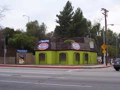
Uh, about that color...and those signs...
Ok, I don't necessarily want to get off on a rant about the architectural blight in the Valley like I have been reading over on Come on, Feel the Nuys...BUT...this remodel took a building that was inconspicuous and blended nicely into its surroundings and replaced it with an ugly eyesore that revolts me every time I drive by, which is at least twice a day for school pickup and drop-off.
How many ways does it offend? Well, let's start with the obvious. The color is horrendous -- a sort of neon, pea green that commands your vision as you drive by. A color that says "Look at me...and be sickened."
Then there are the 2 large signs in a conflicting color scheme.
Then, to add insult in injury, is the new "billboard" on the left, which I don't ever remember being there before. If it was, it was much less prominent before and now commands the all important advertising space at the end of the Sepulveda off-ramp.
At a minimum, I would be much happier if it just had a less hideous color scheme, but, in my opinion, the owners have taken a relatively benign building and turned it into an eyesore. I guess I should count myself lucky that I don't live across the street where I would have to look at it all day long. Yuck!


0 Comments:
Post a Comment
Links to this post:
<< Home